Tea Drops
Steeped in Magic
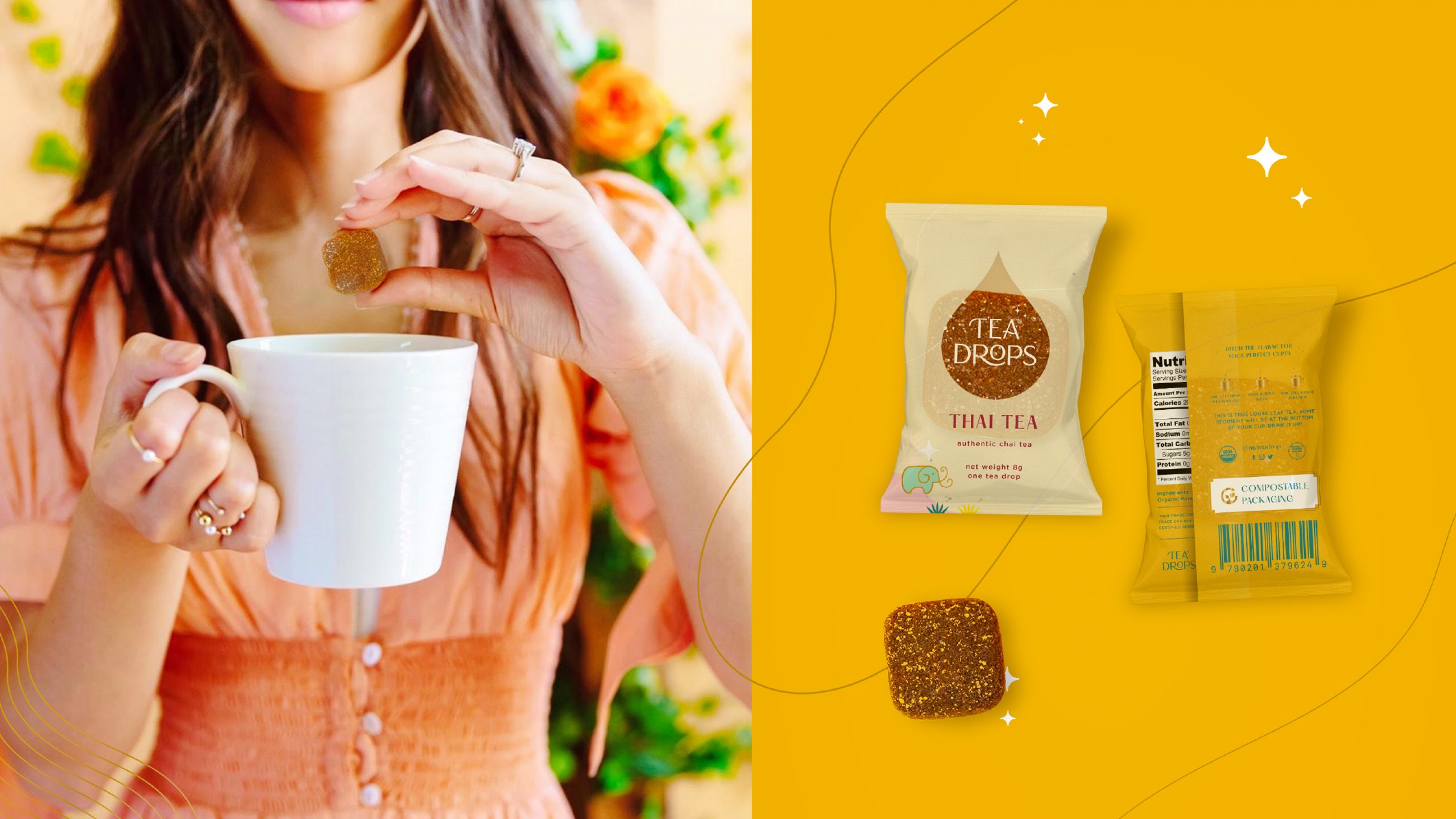
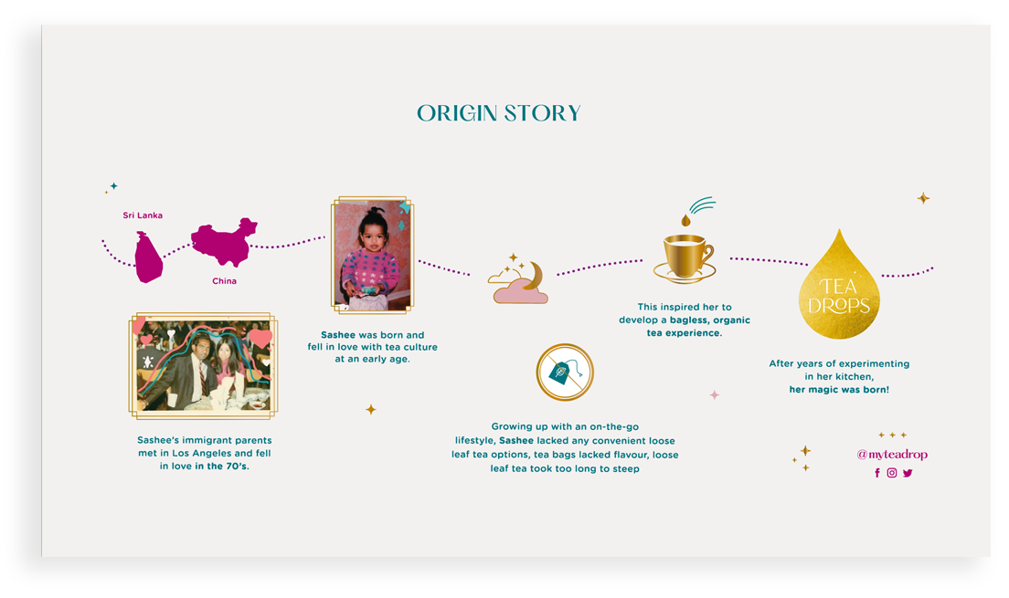
Tea Drops entered the tea space with a unique offering: ground tea pressed into whimsical shapes, offering the richness of brewed, whole leaf tea in a single step and without the waste of a teabag. Tea-enthusiast Sashee Chandran started the company to simplify the ritual of drinking loose leaf tea after fruitlessly searching for high-quality, environmentally friendly alternatives.
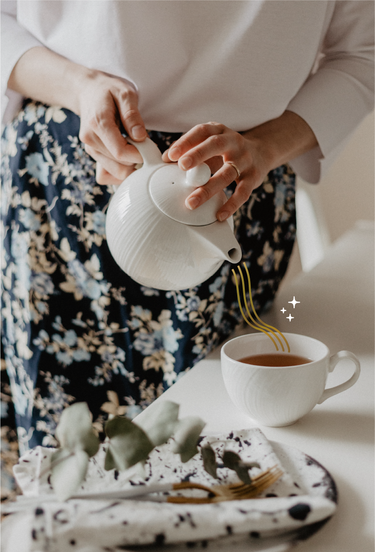
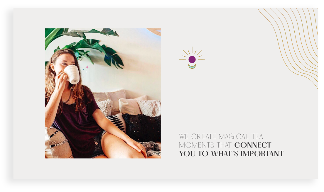
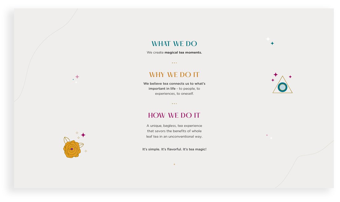
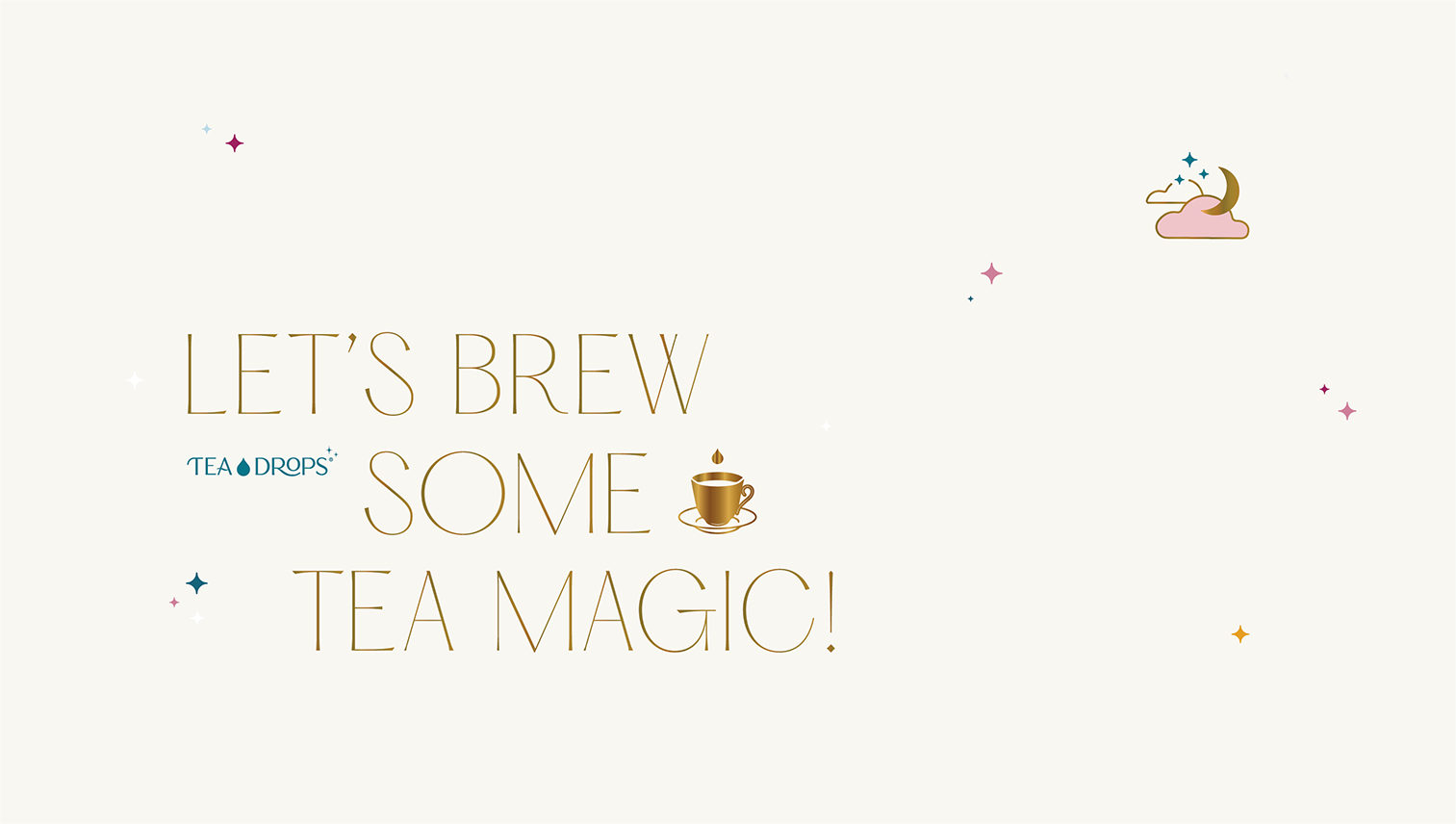
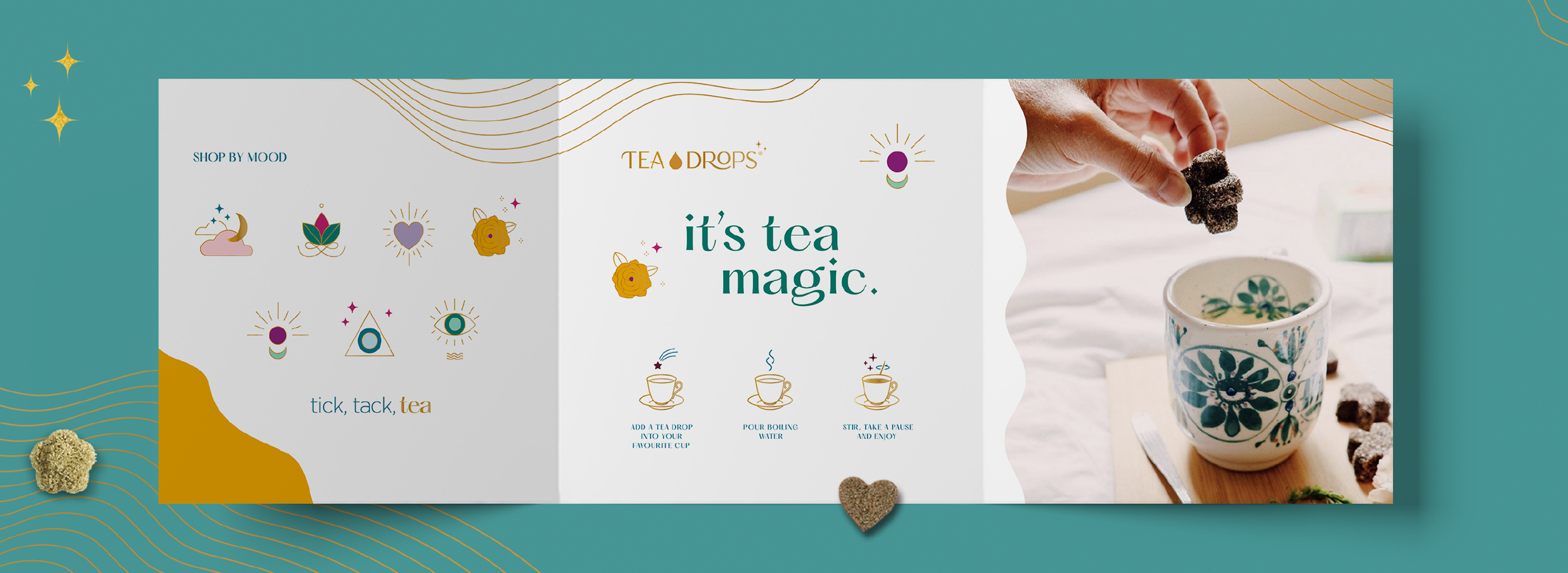
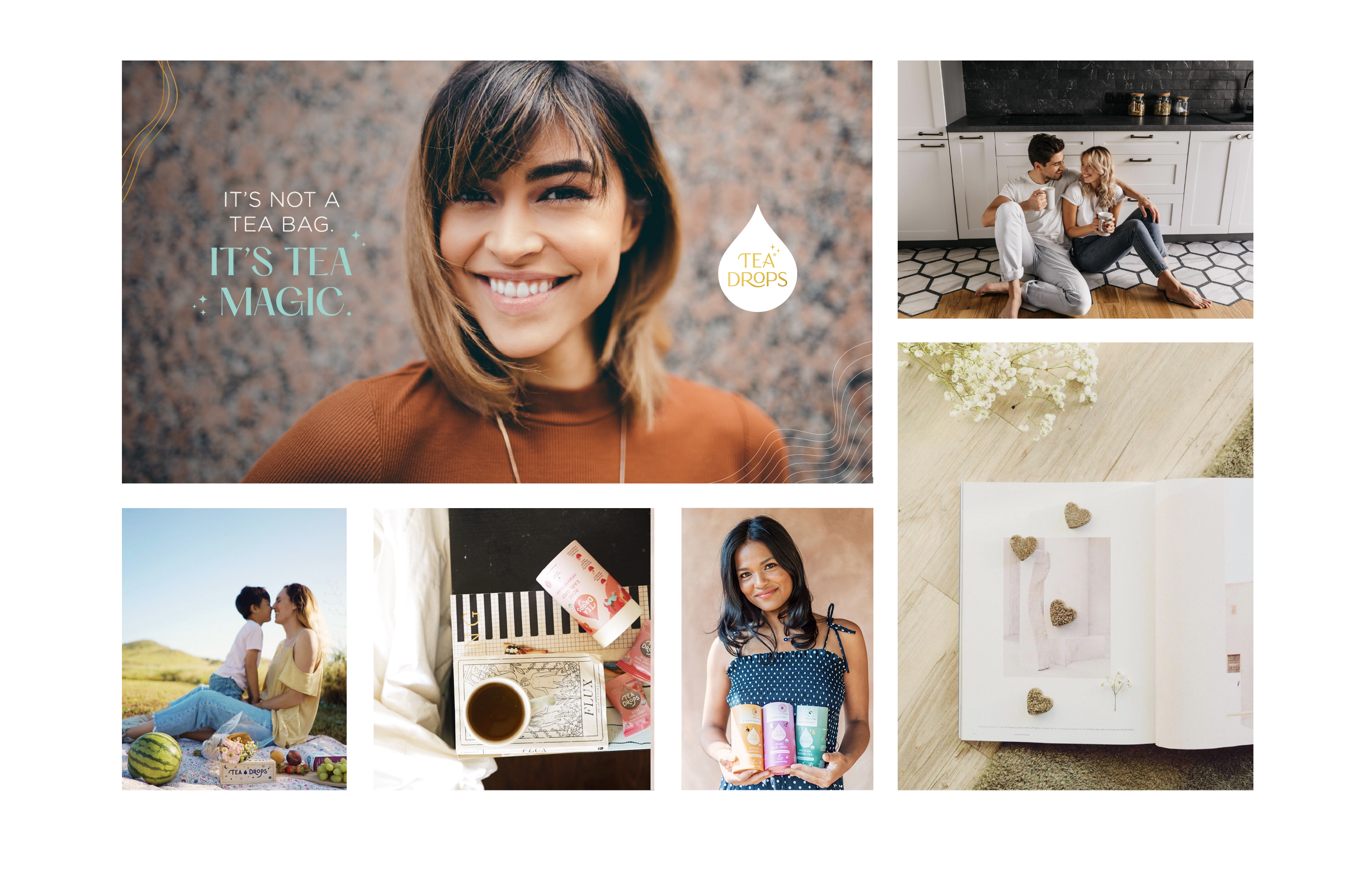
Tea Drops quickly found its market and in 2019 wanted to elevate its branding to better appeal to its core demographic. Charmed by Sashee’s story, and the quiet anticipation you feel watching a Tea Drop dissolve, Martian Arts came in to refine its creative direction. To start, we leaned into the enchantment of the brewing experience, from the mindfulness of the action to its meditative result. This gave form to the brand’s mantra: We create magical tea moments that connect you to what’s important.
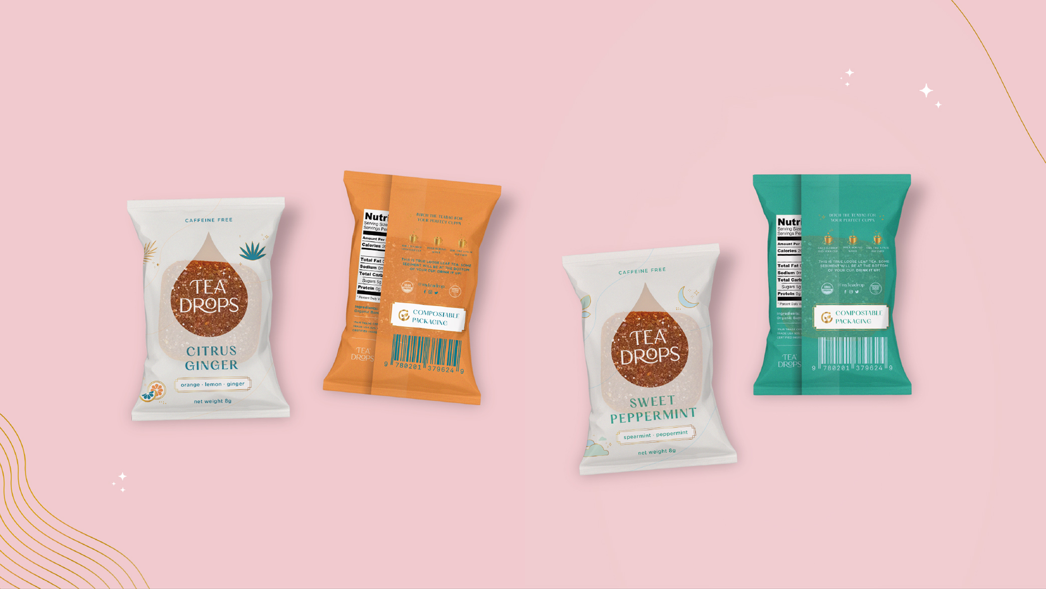
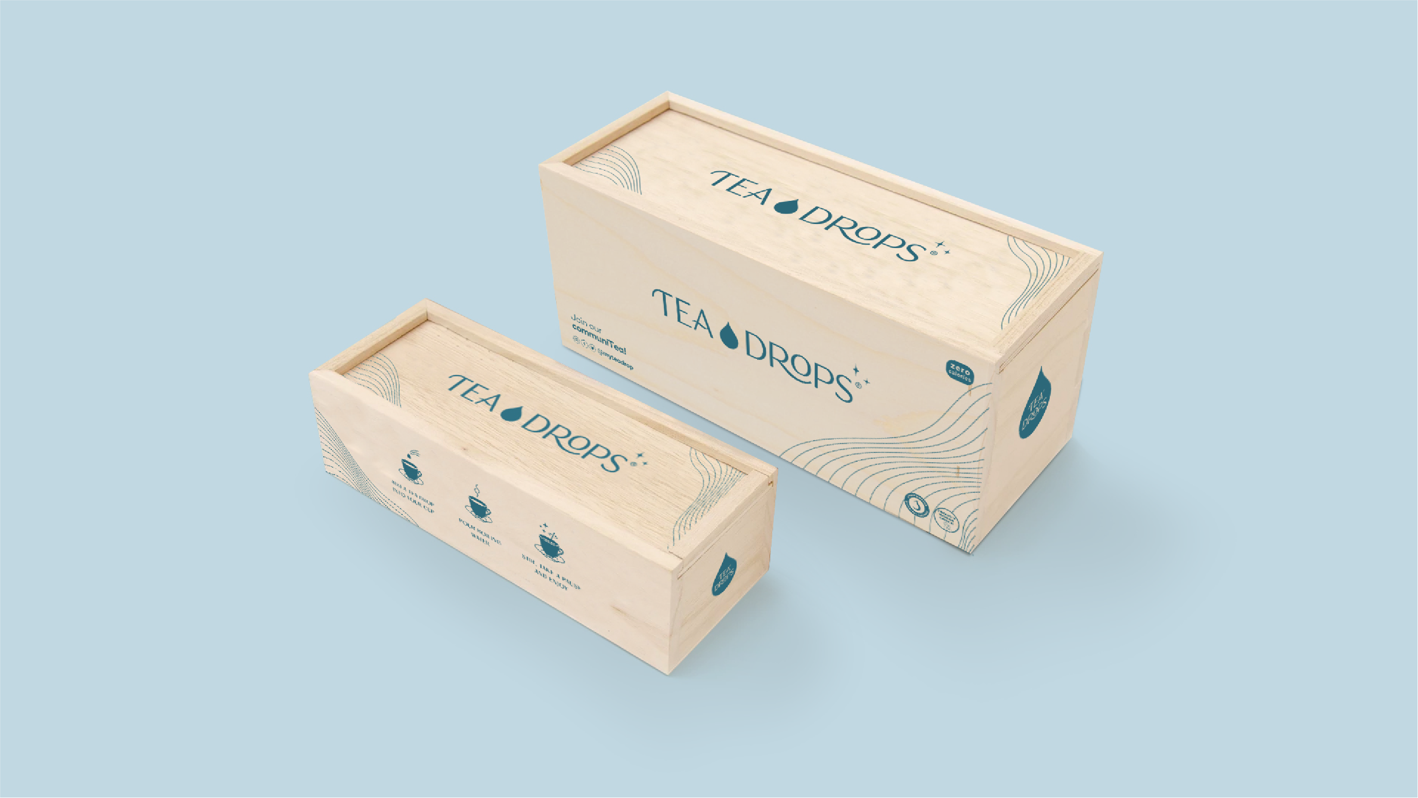
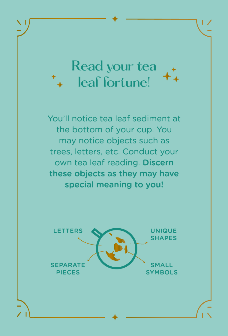
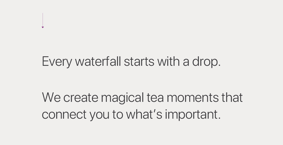
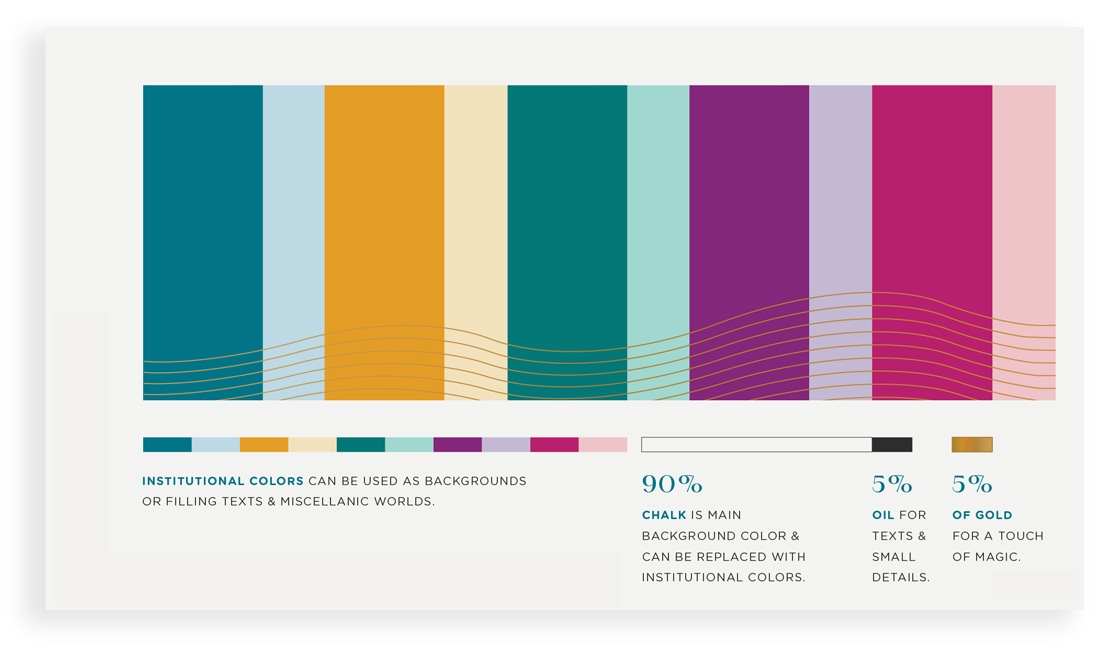
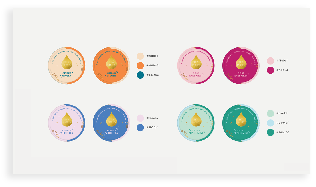
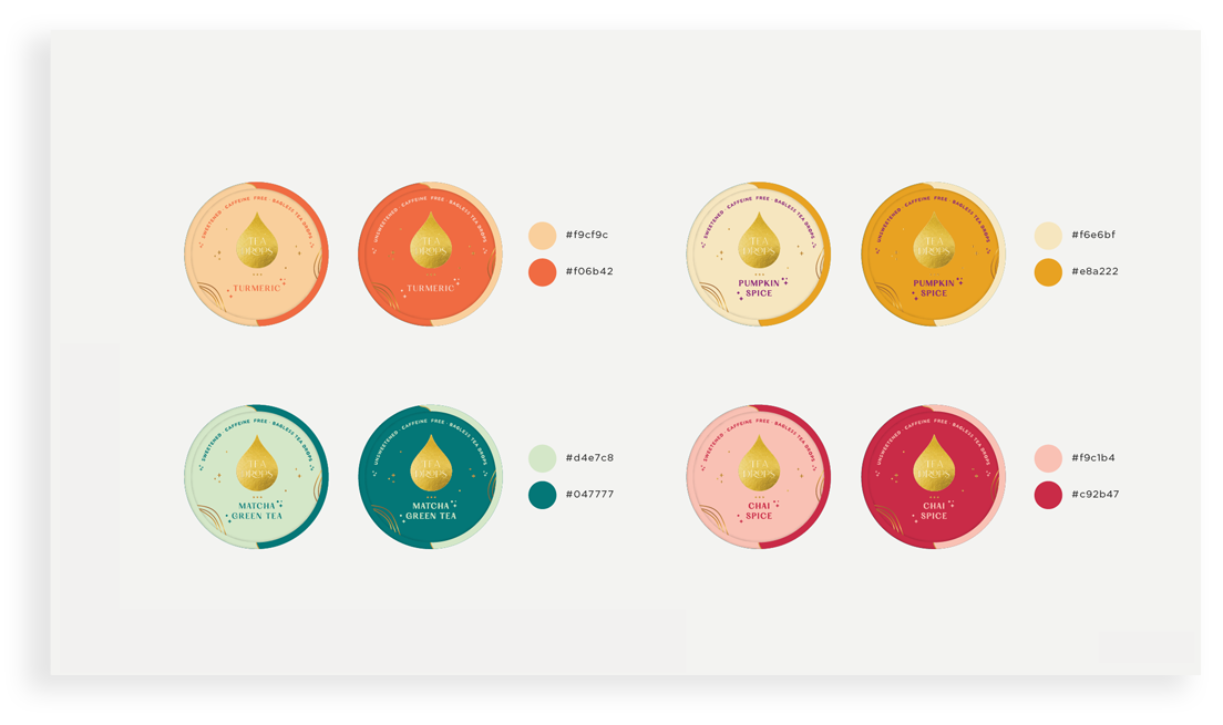
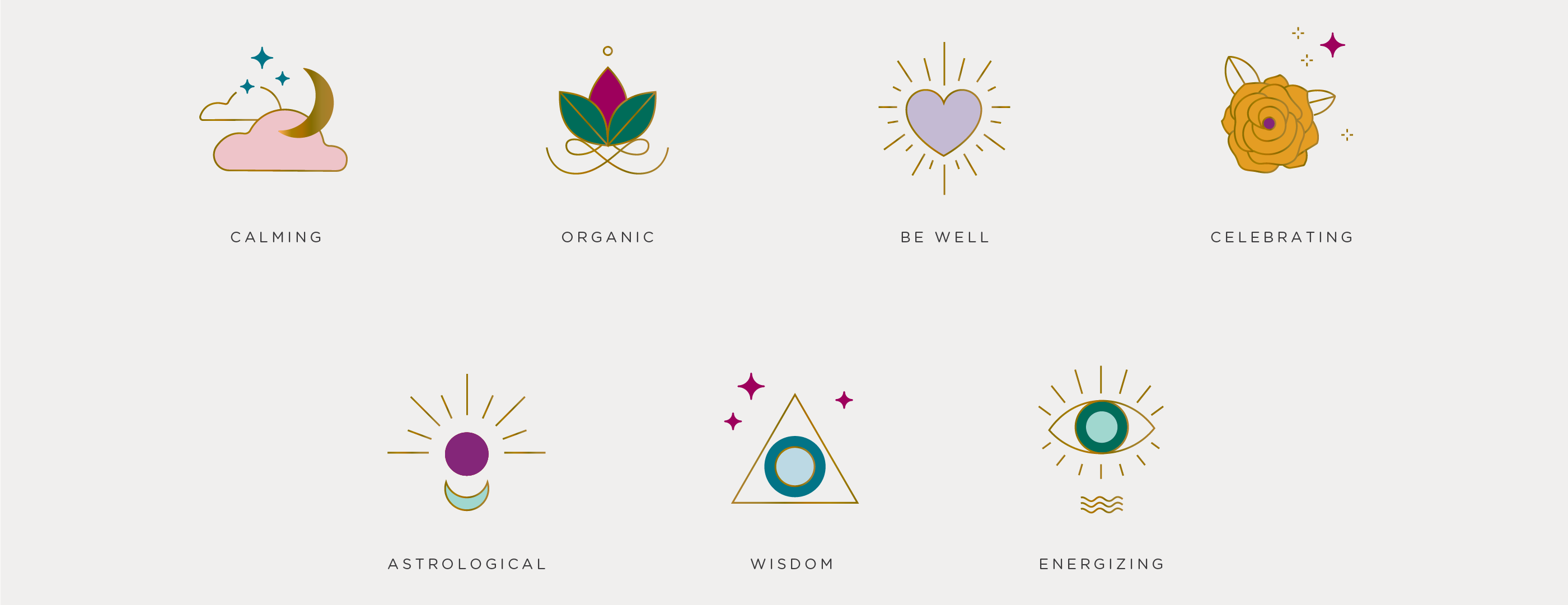
Referencing symbolic inspiration like tarot cards and arcana, Martian Arts extended this magical thinking into our overall creative design. The logo’s drop-shape is a reminder that every waterfall starts with a tiny drop; the gilded type and sprinkling of stars further add to the logo’s magic. The whimsy of the Tea Drop shapes — hearts, stars and blossoms — was incorporated into the rest of the visuals, including the illustrations on the packaging, and the pops of color in the brand’s overall palette.
It was also important to emphasize Tea Drops’ commitment to social responsibility via Thirst Project, which provides clean water to those in need. This partnership is represented on the packaging as well.
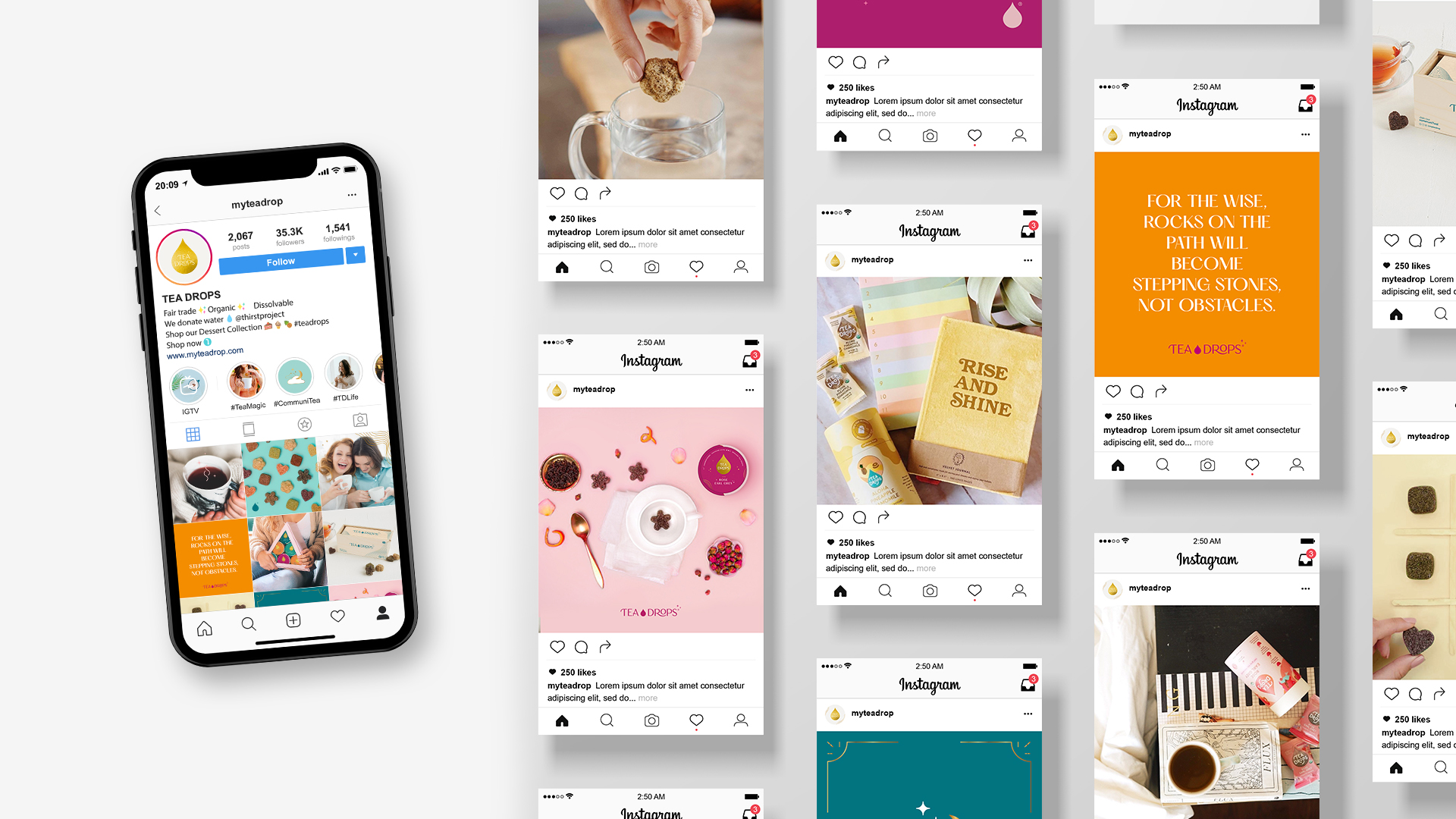
Since a sense of connection is at the foundation of Tea Drops, we made sure to carry that same feeling through on the brand’s social media. On Instagram, a bright, clean aesthetic encourages followers to indulge in and share their own magical tea moments.
Brand
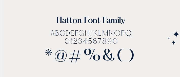
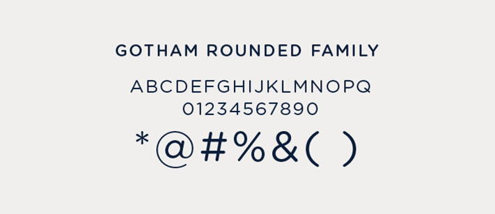
Typography


Illustration


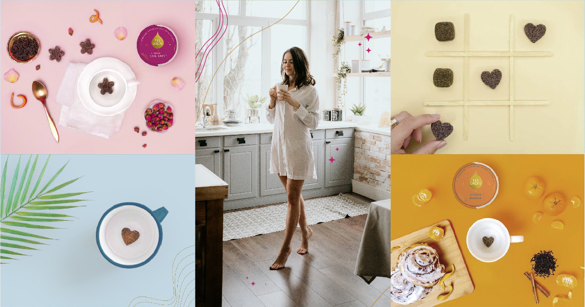
Photography


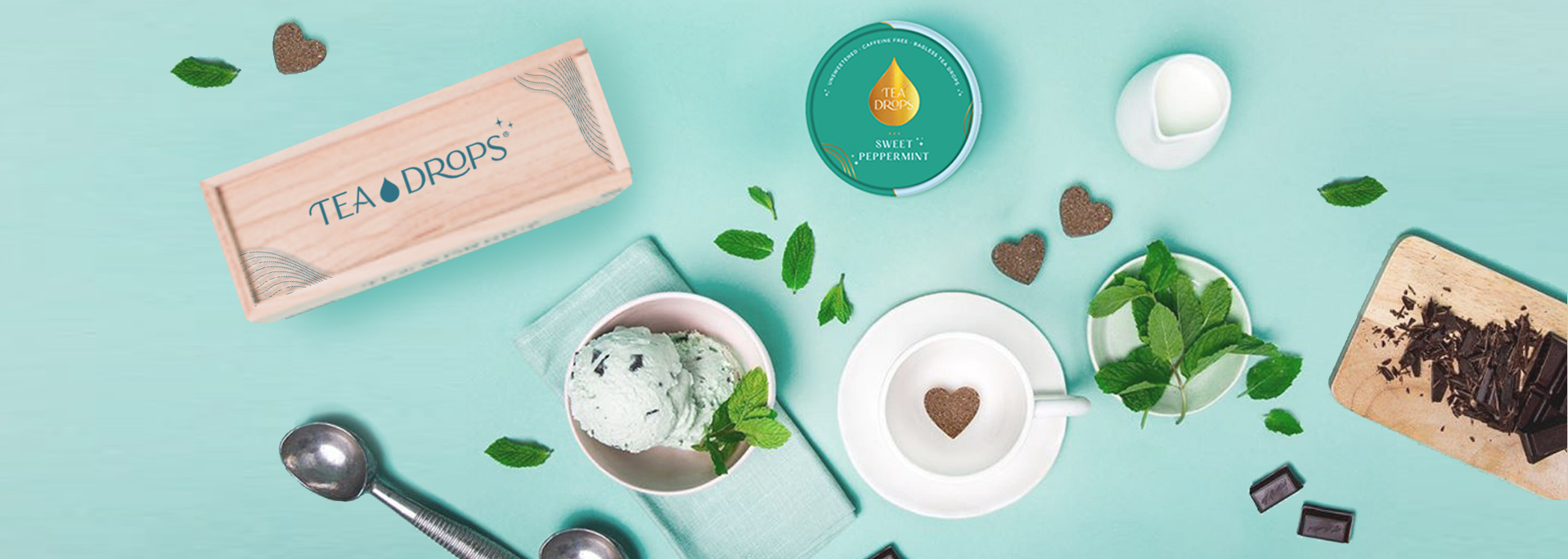
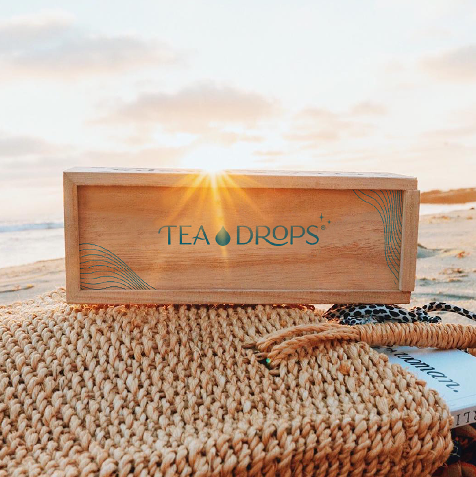
Packaging